The day after Valentine’s Day. I had arranged to meet someone at the Museum of Fine Arts, Boston. Our plan was to visit Fired Earth, Woven Bamboo: Contemporary Japanese Ceramics and Bamboo Art and then wander the rest of the museum for a bit.
It was during the wandering that I came across the introductory panel for Elegant Contortions, an exhibition of Renaissance prints.
Had I any hopes of a relationship blossoming between myself and my companion for the day, this label was the death of them, because I could not stop rhapsodizing about it.
When a label is bad, it is easy to point out the things that are wrong with it. (Everyone’s a critic.) When something is well written, it can be harder to explain. But I’ll give it a shot.
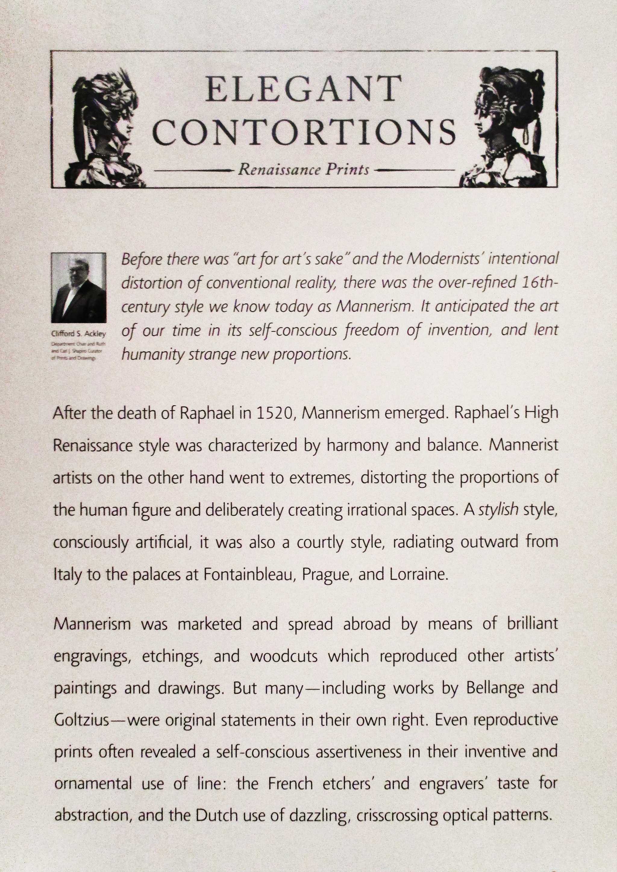
Let’s take a closer look:
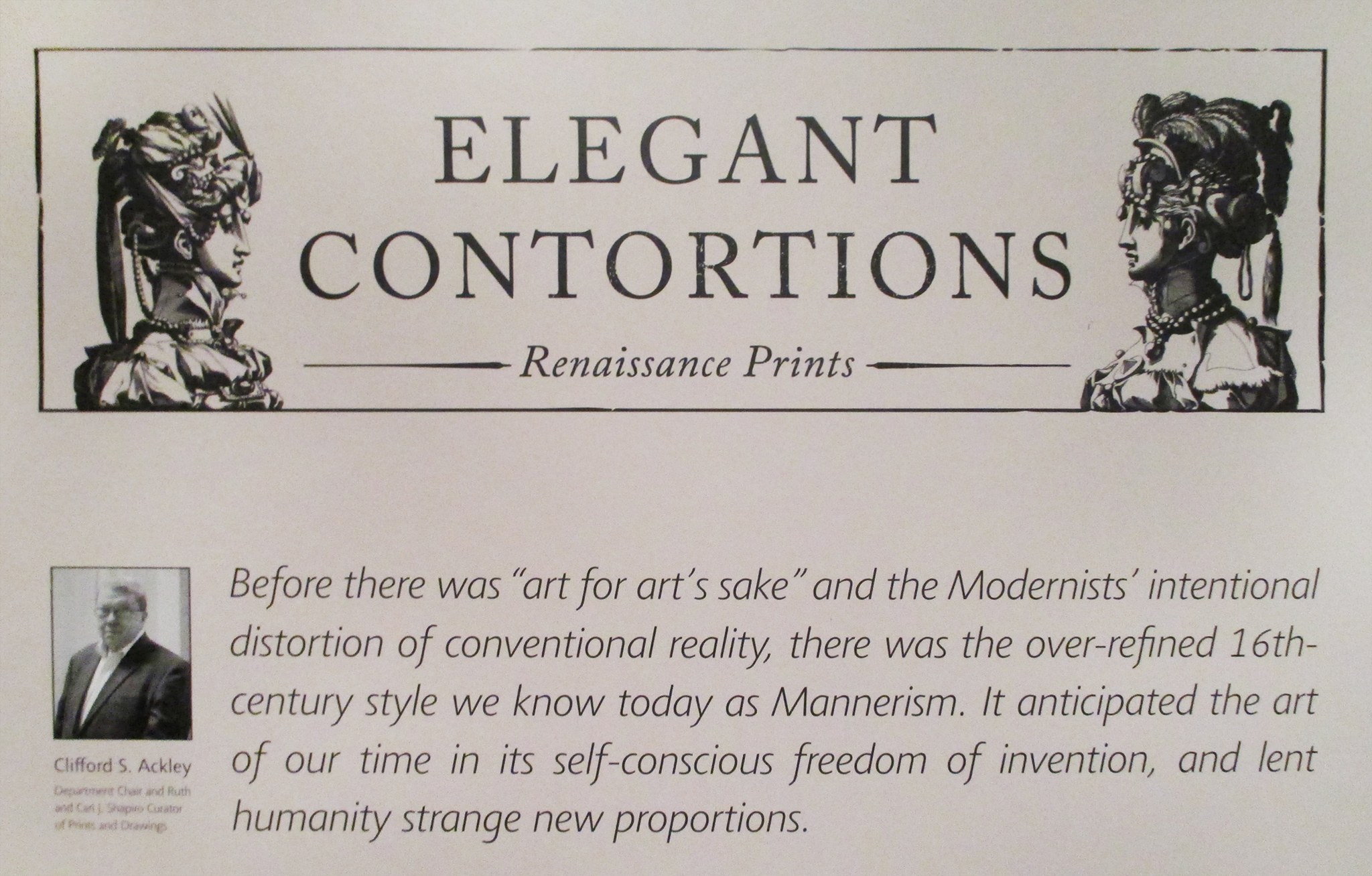
What’s so great about this label?
- The first paragraph is set off from the rest of the text by indentation and italics, making it more inviting to read than if the whole panel of text were set in the same type.
- It’s understandable to someone like me, who is educated but doesn’t have an art background.
- It provides a familiar cultural clue: art for art’s sake. “Okay,” I think, “I’ve heard that phrase.” The curator is saying this work dates from before people started using that expression, and yet, has something in common with it.
- My favorite part of the label is “lent humanity strange new proportions.” It’s beautiful, and it gives me, previously completely uninformed about the art of this period, something to look for as I experience the exhibition. It also connects back to the exhibition title, both in meaning and in sound.
The first paragraph has enough information that I could skip reading the rest of the label if I wanted to: I now know the title of this style/period (Mannerism), when the pieces were created (16th century), and the relationship of the period to Modernism and contemporary art. But the paragraph is so well written that I want to read the rest of the label. I almost never feel that way about museum labels.
I try to explain to my companion how totally awesome Clifford S. Ackley is, and why this label is so much better than the others we’ve seen so far that day. I fail.
I head out into the exhibition to look for distortions, contortions, and strange proportions.
P. S. I never heard from that day’s companion again, but perhaps this blog post will inspire Clifford S. Ackley to contact me. I’d love to talk with him about his labels for Rembrandt the Etcher, also at the MFA.